To pick the fonts that I have used in my magazine I went over to Dafont http://www.dafont.com/
This is were you can download fonts for free. There is a wide selections of fonts to choose from to fit any genera.
I ended up using Orange Juice and Opificio. I used these fonts as I believe they fit my idea for magazine and appeal to my target audience.
The reason I picked these fonts was that I feel that they look youthful which will appeal to my target audience. Having the orange juice as the mast head and cover lines font and the other writing to be in opificio. This being as the orange juice will attract the audience being that its an unusual font and the opificio font looks pop but easy to read for block texts.
Wednesday, 18 December 2013
Tuesday, 10 December 2013
mood board research
Follow siobhan miller's board media research on Pinterest.
Here is the my research were I look on printerest to look at music magazine front covers. this allowed me to see what was already out there and to look at the different ways in which the magazine are made up of. especially with the way that the masthead sometimes goes over the main image or the main image goes over the masthead. This shifts the focus of the magazine to main image or the masthead dependent on which is put forward first.
My main focus with this is to see which artist are on the front cover to include into my articles for my magazine to include into my contents. plus to look at the way the masthead and sell lines are used to make them stand out on the page.
Friday, 6 December 2013
Primary Audience Research
Here is what I have learnt from my questionnaire
My target audience are 11-21 year old females as they were the most to fill out the questionnaire. Rock came out as the preferred genre for a music mag however 77.78% did not read music magazine. Q, NME and Rolling stones came out as the top music magazine which shows that people have a high demand for rock magazines and the fact that NME has a free gift when you buy a magazine. I found out that people are willing to pay up till £1-£2 with 73.43
Here are some comments on what would attract people to a magazine front cover
- Bright colours that contrast well with each other, glossy cover, famous musician/celebrity on the cover page, interesting stories and articles to do with music
- colours with attractive clear headlines and relevent images but not overly crouded front cover
- Exclusive stuff Big music from each region Get readers involved
- Simplistic design (like the magazine Edge) and a variation in content from just reviews etc
- the posters avaliable and the content of the magazine
- Variation of bands each week. Stand out colours. Full band pictures/interviews (not just the lead singer).
- Well, the most of the time it's the colors, picturea and the context in the magazine.
Monday, 2 December 2013
magazine research (social grading and demographics)
To see what popular magazine target audience was like I decided to do some research. Here what I found.
This is called the social grading table and from this I can use this to help me find my target market and see what I can advertise to them. For example my magazine will be based for the target audience of C1/C2 as my target audience are teenagers and college students so this audience stereotypically don't have money. Which is why my magazine price is £3.99.
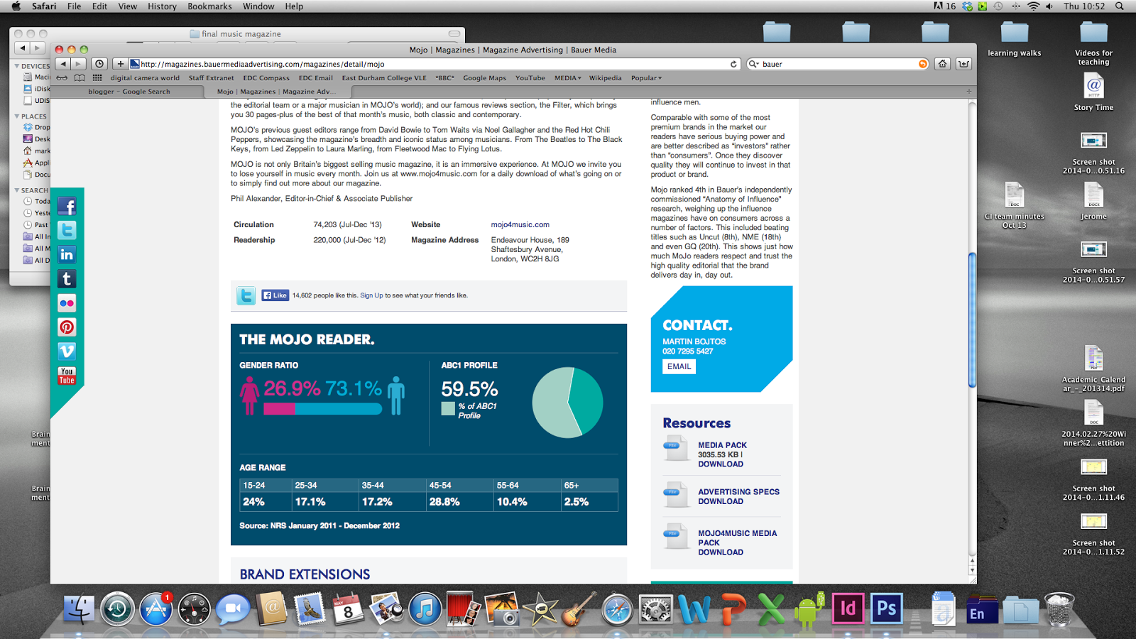
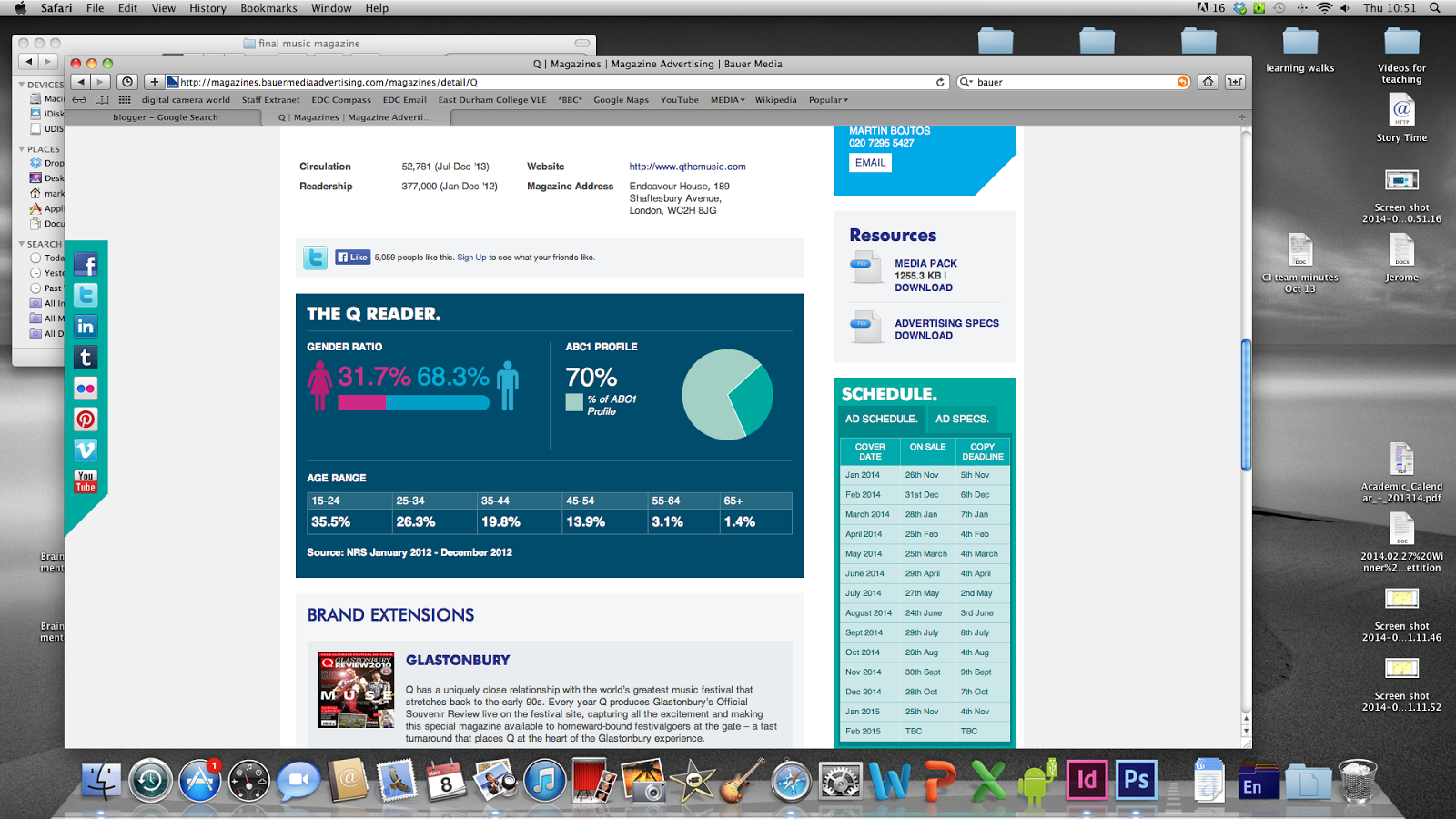
I decided to go onto Baue media magazine to look at the statistics of magazine sales on popular music magazines.
 NME again is male ornate with 24 % being 15-21 year old. this shows that this magazine is more aimed at a older audience which shows through the artist they use in there magazine.
Kerrang is male ornate with 56.1% of its readers being 15-21 year olds which is were my target audience ages is around.
Q is also male dominate with 35.5% of readers being 15-21 year olds.
From seeing this I see that most of the music magazine that are out in the media today are more aimed at the male audience which is why I want to make a magazine which is aimed for the female audience as there is a gap in the market for it.
Analysis of Pop of the Tops magazine
Name: Top of the pops
Price: £2.99
every month
http://www.totpmag.com/
Price: £2.99
every month
http://www.totpmag.com/
From the style of this magazine we can see that the target audience is aimed at young teens girls with all the picture of the new artist and boy-bands. now that we know who the target audience is we can gather that the magazine is mostly going to be about ''gossip,the cutest boys and the best freebies''
Design
The design of this magazine is very busy which is going back to the target audience to help catch the attention of the small children as they will be attracted by the pretty colors.
Masthead
This magazine masthead gives off an impression that the magazine is going to be about a pop magazine with the stars going around the border which links to the idea of the pop stars. With the pink on white background the founts stands out and the found used is kinda girly which proves that the magazine is aimed at girls rather than boys. to the top left hand corner of the magazine just above the masthead is a pug with the BBC logo so we know how is sponsoring the magazine.just next to this we have a sell line which says ''revealed All-new celebs without makeup'' this again shows us our target audience with the word new and the way they have shorten celebrates to celebs were looking at the younger generation. plus its show us what going to be inside the mag which with this sell line is about gossip.
main image-Cher Lloyd
The main image is of 'her Lloyd' who was 4 in the 2010 'x-factor' finals'. with a median close up she takes up most of the magazine front cover along with a headline which acts as the anchorage text due to the text box its in. its kind of like an upside down triangle, cut into 3 sections; one being black, the second pink and the last section white. ''gasp! has straight-talking CHER lost her swagger?'' embedded with this gossip starter is a quote which I presume should be from Cher herself ''I've got major confidence issues'' with the words ''exclusive'' under it to make people buy the magazine.
Coverlines
There are lots of mini cover lines all of them are gossips story's all about boy bands. most of them however are on the left hand side of the magazine which indicates were in the country this magazine would be sold at as most people from the UK read from left to right. however there is one that is on the right''conor's confessions, come out in the wash!'' this is also embedded with a quote from corner put in a speck bubble ''I've got my smalls in a spin!''
In another corner we have a puff used ''are you ready for summer love? '' this engages the audience by using the word 'you' in a rhetorical question it then transfers you to a page with in the magazine with the '' get help from Alex on p16''
near the top of the mag in the left hand corner there is a bit of a what to buy for summer with the slogan ''seriously clever shopping with A* advice!'' all in capital letters. using a yellow back ground grabs people attention as people associate yellow with a warning sign. the stuff they are promoting are quite cheap so again looking upon the younger people as they don't have much money. also its aimed at girls as boys don't normally go round wearing pink nail varnish.
We have free posters :3 which will attract young girls who like putting posters on there walls.
Sunday, 1 December 2013
Mood board of front covers/ content pages and double page spreads
I decided to use photobucket to make a mood board to look at music magazine front covers, DPS and contence pages. http://s793.photobucket.com/
From doing this I was able to see whats already out there in terms of design and what artists are being used and how the front cover images look.
Top of the Pop Double page analysis
Main Image
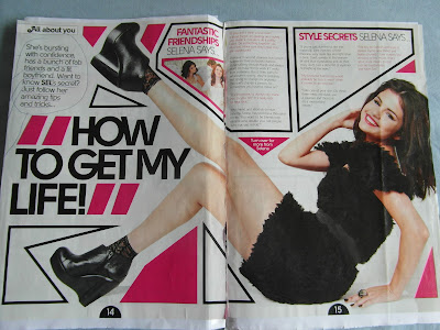
The first thing you see when you open to this double page spread is Selena Gomez; so we can saftly say that she is being used as the main vocal point of this articel. This identifies the targert audience of the magazine, being young teenage girls- hence the pink colors and fans of the artist. The fact that the main image is over two pages is that the its challenging convtions
The way that this double page spread stands out from all the rest is the way that the layout is set with the main image being over two pages instead of one. With this the text are all in strange shape boxes to go around the main image which make the page more interesting to look at the generic magazine page. The colors all work well against the white background as putting any bright color on a white background ensures you a stand out effect. however with the added boldness to the main headline we get a jump out effect which will attract the attention of the reader to ''how to get my life!'' with some of the text being in boxes which highlights the important articles on the double page spread.
Its quite ironic that this page is marked with ''all about you'' when really it got nothing to do with you due to the fact that its on about how to be somebody else; with the main header in bold, captial letters ''how to get my life''
There not alot of text on both these pages, with the main image dominatening the whole of both pages, this makes the page look easy on the eyes but also its contradict itself with not really imformative.
There not alot of text on both these pages, with the main image dominatening the whole of both pages, this makes the page look easy on the eyes but also its contradict itself with not really imformative.
Subscribe to:
Comments (Atom)


