Wednesday 25 March 2015

3rd page Contents design development


With my contents page i wanted something which was not busy and easy for the reader to find the articles that they want to find. 

The reason why I took the page number out from the front cover was because I have images that are linked to the cover stories on the right hand side of the page. I think this looks good overall as it gives the page some colour and its familiar with other regional magazines. 

I put my editor letter in the top left hand corner as at the time I though It would look better out of the way from everything but after looking at the page it looks to cramped up in the corner and makes the page look to to busy on one side to the other. To sort this out I moved the editor letter slightly down and added more text to the left hand side to make the page more even.


As you can see I changed the dotted lines for solid lines as the dotted lines made the page look very messy and not professional looking. however having the solid lines makes the page look more neat and tidy. 

At the bottom of the page I have added page furniture of the: issue number/ Durham magazine and page number. this is normally seen in other regional magazines so it follows the conventions and it acts as like a logo to the reader of the magazine like a brand. 

I added a stoke to some of the founts which is Onia NM the same used in  the front page. this made the text that I wanted to stand out , stand out above all the rest. I also made the background grey to also help make the text stand out a bit more. 


Tuesday 24 March 2015

2nd Advert Page design development page

From my second page Im going to include an advert page this is because in most regional magazines they include and article which promotes something from the local area to promoted there regional identity. For me I have decided to promote a restaurant in my local college. 

As you can see I have found some logos of the restaurants and included them in my adverts. The images however I had to go into the restaurant itself and take the images which are shown in my blog in earlier post. i really liked the one of the whole restaurant as it shows the reader what the place looks like and then the bottom image I just thinks it fits in with the advert.

The curved line was hard to do as you can see with my first attempt but using the right tools in Idesign I managed to get a smooth curve. I decided to include this as I saw it in an advert in a different regional magazine and I liked the idea.   


on some of the leaflets I've found of this restaurant all have the trip advisers logo on so I've decided to include this in my advert. I've also made the background be the same as the logo as it looks more professional and also look like one of the leaflets that they hand out already. 
The fonts I have used is again Oriya MN the same as the one from the front cover this is due to the fact that I want to have continuity in my magazine. However I did use the font Arial in one part of the advert to make the font stand out more on the page. 


I have include a QR code as this brings the advert more up to date with current technologies as then people with smart phones can scan the code and be referred to the restaurants web-sights and menu. 


I made sure that all the relevant information was positions in close proximity's to each other. so like the contact details were all together and all the special offers where near the QR code. as this makes it easy for the reader to read and find the right information that they want. 


The final change I made was the colour scheme I did have it red to fit in with the front cover however this colour was very hard to read ageist the black so I changed it to the colour scheme of the logo of the restaurants and it really works; in making the fonts stand out on the page. 

Front page design development

   
For my front cover I decided to go with this image out of all the ones that I took. I had to go into photoshop to change the contrast and saturation just to make the colours a bit more sharper as due to the weather being a bit dull it made the image look a bit dull. 

I picked this image as there was a nice contrast of the man in blue to all the colours around him which looked nice with Durham cathedral in the background. 

I had a little play around with the colour scheme and I like the idea of using red and white as being the colour scheme for this magazine as it.


For the fonts I used Oryiai MN as it fits in with this classic formal look that I want for this regional magazine which again appeals more for the older target market that I want to attract to this magazine. 

I've added in the top left corner a pug with the issue number and date which helps this section stand out from the rest. Again following the colour scheme of red and white. 

I took away the page numbers from the article as looking at regional magazines they don't do that so to keep in conventions I've took them out. 


I've been told that my articles need to stand out more as from a distance they don't. So I've added a stroke to all the fonts however as I used a font which looks fancy adding the stoke made some of the text look cramped together and not readable. So i had to make the fount more spaced out. 

This really helped making the fonts stand out on the page. 

I also added a circle around my main headline as that the article which I want to stand out the most on my page. 


 I moved some of the article text down along with the image as i wanted to make sure that Durham Catherdral was more visable and not coveed by the masthead or any of the articles. This is because that is icon of durham which makes the magazine identity of Durham for the readers. 

From feedback again I changed the doted lines in the pug and border of the main headline as it didn't really fit on the page so I changed it to solid lines instead.  

I have included some bits at the bottom and made this stretch across the page as this is what we normally see on regional magazines. 

As I've decided to make this magazine aimed at females Im going to change the colour scheme from red to pink as the reds are more male oriented and look more suitable for a rock magazine like ''Q''

Editor letter


For my contents page I have seen that in regional magazines they sometimes have editor letters so I have come up with some editor letters to include in my regional magazine. 


  • Welcome to the first ever edition of the Durham magazine which hopes to keep you up to date with all the husle and busle that happens in the Durham area so kick back and relax and read your way into knowing whats going on locally. 


  • Hi my name is Siobhan and welcome to the first edition of the durham magazine which aims to bring local news straight to the locals. Keeping you up to date with all the local events so that you know whats going on around you. 


Out of the two that I decided to go with the first one as thats the one I prefer out of the two. 

Question for my interview


Here are some of the questions Im going to ask in the interview at Anderson of Durham. Im going to have the interview recorded so that I can scribe up what the manager says into my article. 


  1. What made you decide to pursue a career in fashion and open a clothes shop? 
  2. How long has your shop been in business? 
  3. What brands are the best sellers in your shop?
  4. Over time has there been any changes to the brands that you sell? 
  5. Whats your favourite brand?
  6. Do you get more male or female shoppers?
  7. Do you sell more stuff online or in the shop?
  8. Do you have a certain way that you set up your shop? 
  9. Where do you see the shop and Durham shopping area in 10 years?
  10. How do the people of Durham react to the shop in general? 
I chose these questions as some of them are linked to the shop itself but as this is a regional magazine about Durham I thought it would be a good idea to have questions that are linked in with Durham itself. This will therefore lead itself to the magazine regional identity. 

rethinking my front cover and target audience.


When I was creating my front page for my regional magazine, I had to consider how I would appeal to my target audience. I then decided that to email a regional magazine and see how they appeal to there target market. I got a reply from Living North magazine who sent me a media pdf pack on how they constructed there magazine and there target market was. From this I now know that I want to focus on my magazine towards appealing to a female audience. So I need articles that are aimed at a more women prospective using colours that appeal to females like pink on my front cover. 


http://www.livingnorth.com/northeast/advertising

rethink of my main article idea


Having to rethink my main article idea due to as this is a news story it doesn't really fit in with the articles that are found in regional magazines. I wanted to challenge convention and though up of doing a up to date news story and do an article on the missing students in durham however after emailing some regional magazines editors to ask about articles they have in there magazine and they general say that they do articles that will last a month instead of having current news story. I have also noticed that the articles found in regional magazines are more aimed at a women then men. With articles about fashion and buying stuff for the home. This is why I've descided on two options for my main article  and ageist the news article as there is no target market for this type of article and it would not fit in with the conventions of this magazine. Here are some emails that I got form some of the editors for other regional magazine answering the question on why they did not do up to date news story in there magazine. 


Hi Siobhan,
In journalism there is a distinction between news (things that are happening now and need to be reported immediately) and features (things that do not have to be published immediately but often look behind the news or at people who have been in the news).
The magazine tends to have features rather than news because it is intended to last for a whole month until the next one comes out. We want the stuff in the magazine to have as long a life as possible so it is still worth picking up several days after publication.
We pick the contents like this - we look at what is happening in the month the magazine is to cover. First we include things that have to be included (because they are really big or significant) and if there's room after that, we'll choose the things we fancy writing about and that we think our readers will find interesting.
Hope this helps,
Dave,
Culture

Some of the stories we run are time-sensitive and are linked to something in the news – ie the Magna Carta exhibition in Durham, the 50th anniversary of the Landmark Trust, an exhibition in our area by a local artist, a new book by someone – but we wouldn’t just use the bare facts as you would in a news story. We want to talk in more detail to the people involved, investigate the history of something, add in lots of colour.
Other stories have no time sensitive link – we just run them because, for example, we have heard that someone has a lovely home and ask them if we can do a piece on it, or we might ask a restaurant if we can talk to their chef and run a recipe, simply because our readers expect to see this kind of subject in the mag each month, and we can also get advertising on the back of homes and food features etc
Hope this helps

Jenny Needham | Features Editor
________________________________________ 

Newsquest (Yorkshire & North East) Ltd


One idea was to write about the attractions on the riverside of Durham calling the article the golden mile of Durham. having all the pubs and restaurants in one article would work well in a regional magazine. 

 The other idea was to do an article on a fashion shop in Durham. This would link in with the target audience of regional magazines and follow the conventions of having articles in there about fashion. 

I've decided that i want to have the magazine target audience aimed at females so Im going to go with the fashion shop article over the attractions on the riverside article. I've called up one of the fashion shops in Durham (Anderson of Durham) and I've planned to have an interview soon with the manager of the shop. 

http://www.andersonsofdurham.com/en/


Andersons of Durham
Durham Indoor Market
Durham City
County Durham
DH1 3NJ

0191 386 1110

Tuesday 10 March 2015

main article photos

http://s793.photobucket.com/user/siobhanmiller18/slideshow/

main article photos

yes photo from durham

http://s793.photobucket.com/user/siobhanmiller18/slideshow/no%20photos%20from%20scene1/yes%20photos%20from%20scene1/noDurham%20images/yes%20Durham%20images


yes photo from durham

no photo from durham

http://s793.photobucket.com/user/siobhanmiller18/slideshow/no%20photos%20from%20scene1/yes%20photos%20from%20scene1/noDurham%20images


no photo from durham

yes photos from scene1

http://s793.photobucket.com/user/siobhanmiller18/slideshow/no%20photos%20from%20scene1/yes%20photos%20from%20scene1


here are the yes photos from scene1

The image that I picked for my magazine.

The image that I picked for my magazine. 

Some of the main images that I have chosen for my magazine after looking through all the images I took. 


Advert image in scene1.

This works well with what I want for my advert image. It shows the whole restaurant really well which is what I was trying to create when taking this image. 


Main article image. Durham.

I really like this image a lot with the iron bars acting as a good frame for the image. This links in well with the article I want to write about the students in Durham who feel into the river when they where drunk. 


Front cover image.  Durham. 

I will have to crop this image to make this portrait to only have the bit with Durham cathedral and the man in the blue jacket. This is because its a nice contrast with the blue on the brownly green background. 


No photos from Scene1 restaurants

http://s793.photobucket.com/user/siobhanmiller18/slideshow/no%20photos%20from%20scene1


For my advert page I had to take some images of a local restaurant be included with my advert. Here are the no photos from that photo-shoot. These where either blurry or didn't really fit into my magazine.  

KFC Radio Spot/ Radio Add ideas


Radio ads

For my radio add I have to come up with a script that includes the conventions emotive language. like ''Original Durham regional magazine, Extra content to all the hustle and bustle  in Durham''. 

looking at this radio ad for KFC they use the idea of repeating information to bring the point across as there main selling point of there add ''low prices- prices so low'' with emotive language like ''dark, delicious, extra crispy , flavoursome original recipes and tender roast''  

Billboard advert ideas

Billboard advert ideas

As part of my media coursework I have to come up with a billboard and a radio add that will consist along side my magazine. 

Billboard ads

Some ideas that I have for the billboard ads is to have my front page (which I still have to finish) on the billboard and then have the text to the left. As then I will be following the conventions that are normally seen with normal billboard adds conventions. They normally consist of one main image which is relevant to what they are trying to sell and then one or two slogans to anchors the image.

 Being as these are promoting things which are well know they don't need to show a lot of writing as the logos and images do all the talking. 

Something I may consider doing is creating a logo for my magazine and a colour scheme for my magazine as this will create a brand for it allowing it to be easier to market my magazine. 


Some of the things that I want to include in my magazine add is:

''First official Durham magazine'' ''keep up to date with everything in Durham'' ''out every month'' links to magazine web sights/ social media. 


Friday 6 March 2015

First mock up on my magazine front and advert page


Here are my first mock up on my magazine front and advert page. I have not added any images as of yet but I have got some images to put in, I just wanted to see what the layout will look like. At the min I like the idea of the red font with the black as its a good contrast between the two colours. 


Next time I would like to add the image to the pages and I also want to make the line on my advert page more smooth a


2nd page ideas

2nd page ideas 


From my second page of my magazine what we tend to see in regional magazine are adverts for products that are relevant to the local area. So for my magazine I am planning to do an advert on a restaurants in the local college and if that dose not work do an advert for the hair salon which is also in the college. 

I went along to see if I could pick up some leaflets to see what the colour scheme and fonts they use on there leaflets to icoriater them into my magazine. Here is what I have found. 


From these I can include them I my magazine using the fonts and colour schemes to make the advert look my realistic and professional. I think I personal like the idea of useing the restaurants as I can take an image of the restaurants itself as the main image of the advert. I can also include a QR code which will link the reader to the websight of the restaurants so you can look at the meun online. and then i can also include a coupon to a free meal or get a free starter and dessert if you buy a main course during happy hour. 

Front cover and Main Article image.


Front cover and Main Article image. 

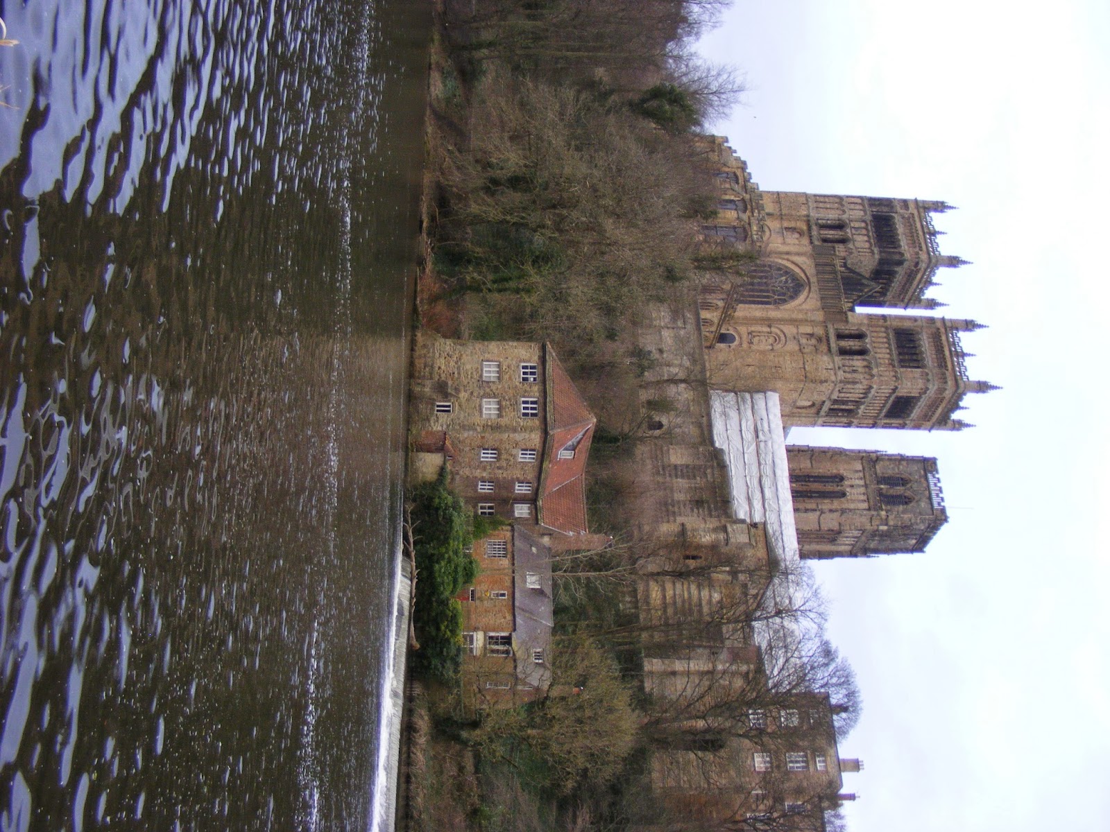
As my magazine is going to be based on Durham I thought the best way to show regional identity was to take an image of the main icon of Durham which would be Durham cathedral. For my main article image; My story is on the recent incidents that happened in Durham with the students getting drunk and downing in the river. So I wanted to get a image that would relate with this story which showed where the students where found but also showing the river and how close the path is to the river. 

Front cover image ideas.


Main article image ideas. 


I think for me to be able to pick the final images for both the front and main article I may have to just have a practice run and make a mock up of my magazine and place these images in to see which one works best with the page layouts that I have.