Tuesday, 10 March 2015

Billboard advert ideas

Billboard advert ideas

As part of my media coursework I have to come up with a billboard and a radio add that will consist along side my magazine. 

Billboard ads

Some ideas that I have for the billboard ads is to have my front page (which I still have to finish) on the billboard and then have the text to the left. As then I will be following the conventions that are normally seen with normal billboard adds conventions. They normally consist of one main image which is relevant to what they are trying to sell and then one or two slogans to anchors the image.

 Being as these are promoting things which are well know they don't need to show a lot of writing as the logos and images do all the talking. 

Something I may consider doing is creating a logo for my magazine and a colour scheme for my magazine as this will create a brand for it allowing it to be easier to market my magazine. 


Some of the things that I want to include in my magazine add is:

''First official Durham magazine'' ''keep up to date with everything in Durham'' ''out every month'' links to magazine web sights/ social media. 


Friday, 6 March 2015

First mock up on my magazine front and advert page


Here are my first mock up on my magazine front and advert page. I have not added any images as of yet but I have got some images to put in, I just wanted to see what the layout will look like. At the min I like the idea of the red font with the black as its a good contrast between the two colours. 


Next time I would like to add the image to the pages and I also want to make the line on my advert page more smooth a


2nd page ideas

2nd page ideas 


From my second page of my magazine what we tend to see in regional magazine are adverts for products that are relevant to the local area. So for my magazine I am planning to do an advert on a restaurants in the local college and if that dose not work do an advert for the hair salon which is also in the college. 

I went along to see if I could pick up some leaflets to see what the colour scheme and fonts they use on there leaflets to icoriater them into my magazine. Here is what I have found. 


From these I can include them I my magazine using the fonts and colour schemes to make the advert look my realistic and professional. I think I personal like the idea of useing the restaurants as I can take an image of the restaurants itself as the main image of the advert. I can also include a QR code which will link the reader to the websight of the restaurants so you can look at the meun online. and then i can also include a coupon to a free meal or get a free starter and dessert if you buy a main course during happy hour. 

Front cover and Main Article image.


Front cover and Main Article image. 

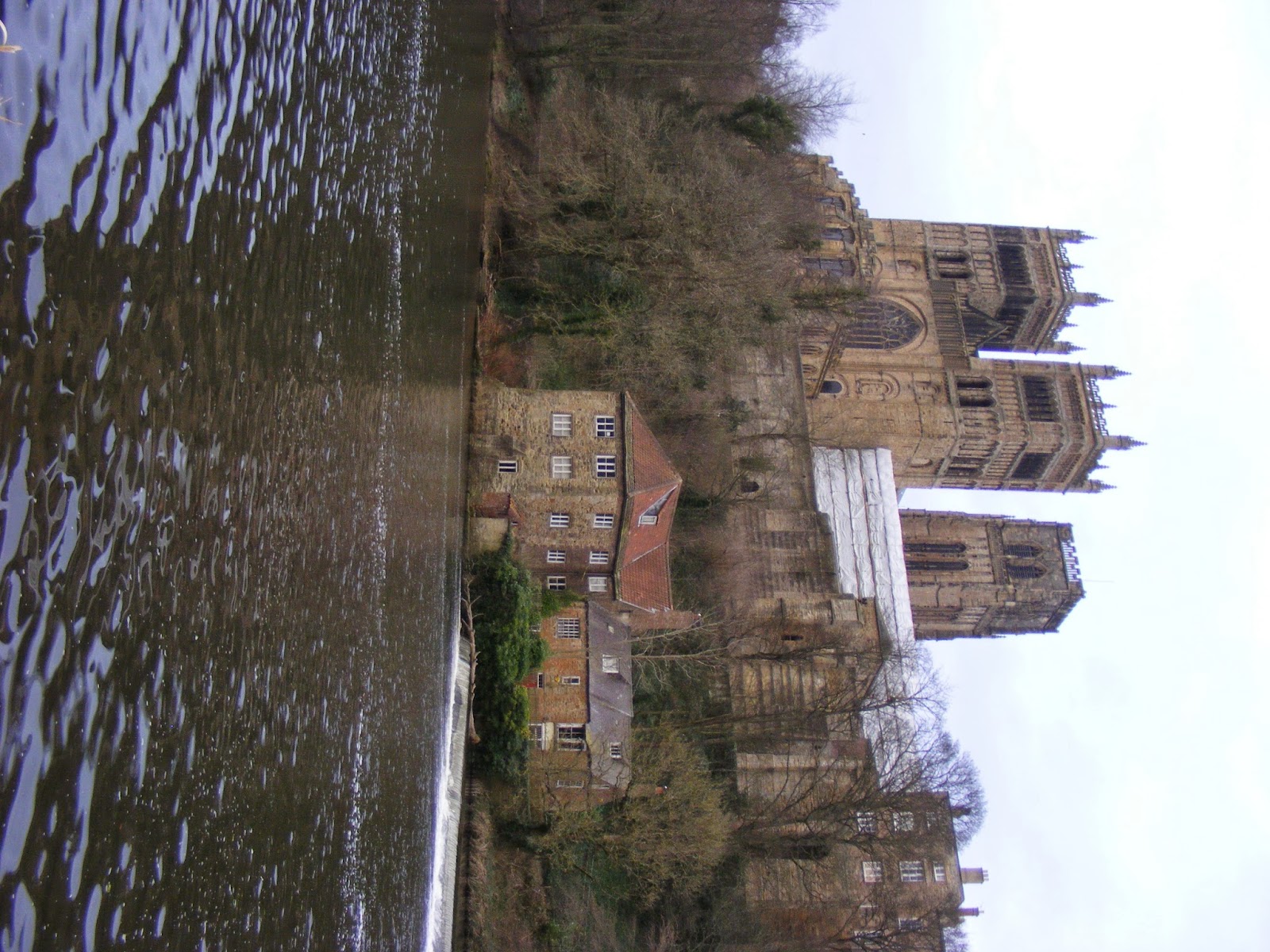
As my magazine is going to be based on Durham I thought the best way to show regional identity was to take an image of the main icon of Durham which would be Durham cathedral. For my main article image; My story is on the recent incidents that happened in Durham with the students getting drunk and downing in the river. So I wanted to get a image that would relate with this story which showed where the students where found but also showing the river and how close the path is to the river. 

Front cover image ideas.


Main article image ideas. 


I think for me to be able to pick the final images for both the front and main article I may have to just have a practice run and make a mock up of my magazine and place these images in to see which one works best with the page layouts that I have. 


Tuesday, 3 March 2015

Drawn plans for my magazine

Drawn plans for my magazine. 


Front Page 


For my front cover  I have decided to keep it simple and not have lots of stuff on the page. I am planning to go to Durham itself and take an image of Durham cathedral for my main image. I have decided this because this will fit in well with showing the magazine regional identify as everyone knows that the cathedral is the icon of Durham. This image is also linked to one of the articles I want to do about Durham students as the cathedral is part of the students campus. 
Durham Cathedralmore info
The College
Durham DH1 3EH, United Kingdom
+44 191 386 4266

2nd Page 
  
For my second page I am going to have to create an advert so have decided to create and advert for the local restaurants in my area but if that dose not work then I can also made an advert for the local hair dressers. I am going to also see if I can get leaflets from these places so I can see what colour schemes they have to incorporate them into my magazine. 
3rd Page

For my 3rd page I am going to have the editor letter which I will have to produce in the top left corner of my magazine maybe include a small pug with a image of me there. under that I will have contact details and links to my email and social media to allow the reader to contact me easily. I would like to have the content in the middle with images that will link to article inside to the right hand side of the page just to make it look more professional. Also I may include a smaller image of the front cover here to link in the cover stories or just have a section of the content page for them. sections like: regulars, hot topic/just in, whats in. For page furniture I am going to have the Durham magazine title in the bottom corner along with the page number and issue number. 

 4th Page


For the 4th page which will be my main article I going to have the page split into two with the image on the top and the a 3 column article under that. I would like a quote in between my article so I will have to do an interview with someone. The main article that I will focus this page on is the story about the student in Durham. As when I am out taking the image of the cathedral I can ask the people around there opinions on the matter. To help me write the article I will look at newspapers article and the new sights on the incident to get a idea of how they wrote about the matter. Along the bottom of the page I want to again include page furniture of the issue number, Durham title and the page number as it shows that each page has a structure to it. 

Friday, 27 February 2015

Articles idea's


After looking at many different articles that are related to regional magazine I have a rough idea of what the layout should look at.

Here are some article ideas that I would like to include in my magazine.


  • Fashion- what to ware in college or in Durham
  • Restaurants/pub-college- interview with the local pub owner
  • Hair/beauty salon
  • What on- gigs, theatre at college. 
  • Education in college/ local area

And the name for my magazine is going to be Durham as my magazine regional identity is the Durham area.


The Crack Regional magazine analysis


The Crack Regional magazine analysis

Front image


The Cracked magazine when looking at the front cover we get a very arty style to the magazine which can be seen with the main image on the front cover which is very bold. The masthead of the magazine goes well with the background as the fonts used blend in with the background not too much as it still stands out against it with the white colours used.

Under the masthead we have the sell line/slogan which state where in the region this magazine is aimed at ''northeast'' and then sections and themes that will be in the magazine such as ''music, fashion,comedy and theatre''

There is only one main article on this front cover ''Jonathan Yeo books on Tyne'' which gives you there quirky style that they use within the magazine which give the magazine its own identity. This suggest a that the target audience for this magazine will be people from the upper middle class who are interested in art and extra curriculum activities that people who have some disposable cash will be able to do.

2nd + 3rd Page

We have a advert on the second page for a drink which may be a local drink for the area that this magazine is based at.

On the 3rd page we have a very busy page with links to the online website at the top next to a smaller version of the front cover not with the article link but to show that its a painting.  They have a section of the page showing who worked on the magazine with there contact details which is a nice touch as if you wanted to talk to anyone who worked on the magazine you can.

With the actual contents there not a lot there with only really 5 articles but that may be because the magazine is mainly a listing magazine showing whats on and stuff rather then telling about whats on. So with the articles here there a lot more writing to try and sell the article to the reader. Rather then in other magazine they just put the article header.

Underneath of the contents we have the an add for readers to subscribe for a year so they can get the magazine derived to them rather then them having to buy the magazine from the shop. This shows how big the distribution must be for this magazine that they are promoting this.

They do have images which look like they are related to bands and more art related stuff which again shows there target audience they are trying to appeal to.

With the article here they use the four basic principles of contrast, repetition, alignment and proximity. With the repetition side of things we can see the similar colours and fonts are used to keep the reader familiar to this and hopefully when they are out and about they will see something similar and that will act as a trigger object as they remember the product in question. 


4th Page

The articles shown in this magazine are very busy with a lot of wring, this however is sectioned off in neat areas by page furniture, images and boxes which work well on the page. also each article have there own sub section with header like ''tongue and groove'' which tell the reader the theme of whats on the page and that the articles on the page will be relevant to that theme.