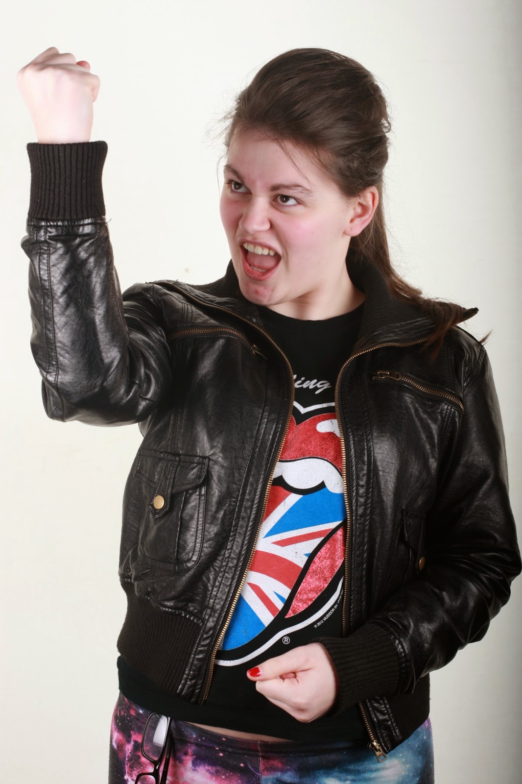
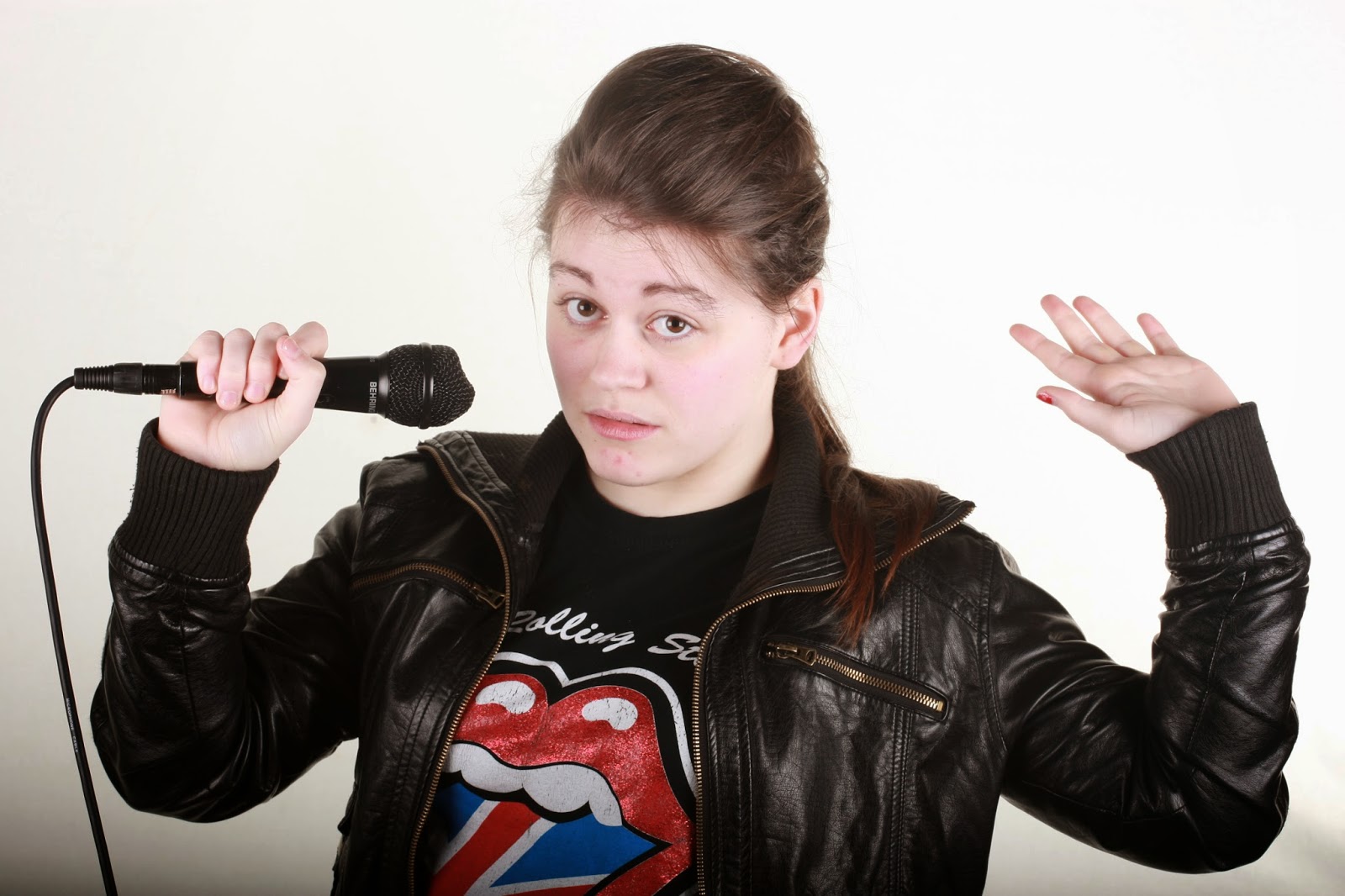
So choosing images to use in my magazine. I had to go though a lot of images to narrow it down to the images that im going to show u. First I went on social media such as Twitter and asked people which they liked. I then also went though them as well.
Right like this image as well she looks a lot more pop than my last model. there space around her where i will be able to place cover stories which is a good thing however there isn't that much room for a masthead unless I wanted to have the masthead overlapping some of her hair which might work with my orange juice font that I have.
This image would look great on a DPS as an image going across two pages. If I do this though I will have to go on photo-shop and sort out the background and make it white as when you look at the bottom of the image; as my model is holding her hands up she has stopped the light reaching the bottom of the image making it a bit shadowy.
This has to be my one of favorite image out of my photo-shoot. I like the depth of field effect that has happened with the mic being in focus along with the rest of the image. if I use this image I will have to photo-shop the background white and make her top go all the way down. I made her do this pose as I was thinking of my question and answer DPS and I wanted it to look like she was holding out the mic to see what the audience have to say.
I like this image there room above the head which allows room for the masthead and there also room on the left hand side of the image for the cover lines which is good as we read left to right. Again if I use this image I just have to make the back ground white on photo-shop. The pose she has I was going for a pop rock take on things.
This image if you remember is the same pose I had my other model do and I just wanted to see what effect it will look like if I have the model who looked more pop doing the same pose. well its ok I do have room for a masthead but I don't know if i like it that much to put on my front cover.
I took this pic as I wanted to get an image of her top and its was mainly to be used in my DPS or content page. I do like and im hoping that I can fit it in somewhere into my blog.
This image will work for my front cover if I have a good headline to go with it to explain why she looks sad. there enough room for a masthead and there room for cover-lines. I might use this as an album cover as im going to try and make a quick free album in my magazine. This is because in pop magazine there normally free stuff to get people to buy the magazine so I feel that it would appeal to my target audience.
I love this image XD but I don't think unless i use it in my front cover that I will be able to place the image any were. I was thinking DPS but I don't think the pose really fits into a question and answer.
This is another one of my favorite images and I will definitely using this somewhere in my magazine. mainly as the pose fits in with my headline ''Leah pops back into the charts''
Another DPS photo which will work. Maybe if the glasses were not covering her eyes so much then this image would be better. But the pose fits in with the question and answer theme. As it looks like she weighing up her options holding her hands out like that.
Another DPS I just wanted her to look like she was singing. I like it but I think its missing something.
I like how she looking directly at the audience as it grabs the readers attention and involves them more with the article but I think its not working with the mic being help up like that.
I like this image but somebody told me it looks like she about to fall over XD I think I can now see that and I still like it I might just have to adjust some angles and play around with this image.
This is a really good image as there is loads of room for a masthead. With the way her hand is held out I can maybe put a cover story or even the headline of the magazine there.


No comments:
Post a Comment