Main Image
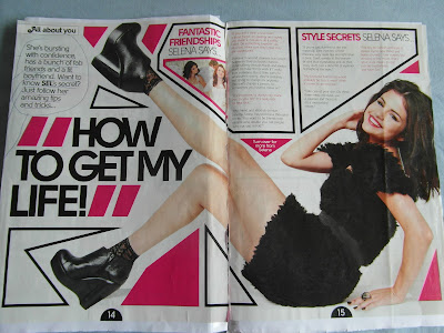
The first thing you see when you open to this double page spread is Selena Gomez; so we can saftly say that she is being used as the main vocal point of this articel. This identifies the targert audience of the magazine, being young teenage girls- hence the pink colors and fans of the artist. The fact that the main image is over two pages is that the its challenging convtions
The way that this double page spread stands out from all the rest is the way that the layout is set with the main image being over two pages instead of one. With this the text are all in strange shape boxes to go around the main image which make the page more interesting to look at the generic magazine page. The colors all work well against the white background as putting any bright color on a white background ensures you a stand out effect. however with the added boldness to the main headline we get a jump out effect which will attract the attention of the reader to ''how to get my life!'' with some of the text being in boxes which highlights the important articles on the double page spread.
Its quite ironic that this page is marked with ''all about you'' when really it got nothing to do with you due to the fact that its on about how to be somebody else; with the main header in bold, captial letters ''how to get my life''
There not alot of text on both these pages, with the main image dominatening the whole of both pages, this makes the page look easy on the eyes but also its contradict itself with not really imformative.
There not alot of text on both these pages, with the main image dominatening the whole of both pages, this makes the page look easy on the eyes but also its contradict itself with not really imformative.


No comments:
Post a Comment