Friday, 27 February 2015

Articles idea's


After looking at many different articles that are related to regional magazine I have a rough idea of what the layout should look at.

Here are some article ideas that I would like to include in my magazine.


  • Fashion- what to ware in college or in Durham
  • Restaurants/pub-college- interview with the local pub owner
  • Hair/beauty salon
  • What on- gigs, theatre at college. 
  • Education in college/ local area

And the name for my magazine is going to be Durham as my magazine regional identity is the Durham area.


The Crack Regional magazine analysis


The Crack Regional magazine analysis

Front image


The Cracked magazine when looking at the front cover we get a very arty style to the magazine which can be seen with the main image on the front cover which is very bold. The masthead of the magazine goes well with the background as the fonts used blend in with the background not too much as it still stands out against it with the white colours used.

Under the masthead we have the sell line/slogan which state where in the region this magazine is aimed at ''northeast'' and then sections and themes that will be in the magazine such as ''music, fashion,comedy and theatre''

There is only one main article on this front cover ''Jonathan Yeo books on Tyne'' which gives you there quirky style that they use within the magazine which give the magazine its own identity. This suggest a that the target audience for this magazine will be people from the upper middle class who are interested in art and extra curriculum activities that people who have some disposable cash will be able to do.

2nd + 3rd Page

We have a advert on the second page for a drink which may be a local drink for the area that this magazine is based at.

On the 3rd page we have a very busy page with links to the online website at the top next to a smaller version of the front cover not with the article link but to show that its a painting.  They have a section of the page showing who worked on the magazine with there contact details which is a nice touch as if you wanted to talk to anyone who worked on the magazine you can.

With the actual contents there not a lot there with only really 5 articles but that may be because the magazine is mainly a listing magazine showing whats on and stuff rather then telling about whats on. So with the articles here there a lot more writing to try and sell the article to the reader. Rather then in other magazine they just put the article header.

Underneath of the contents we have the an add for readers to subscribe for a year so they can get the magazine derived to them rather then them having to buy the magazine from the shop. This shows how big the distribution must be for this magazine that they are promoting this.

They do have images which look like they are related to bands and more art related stuff which again shows there target audience they are trying to appeal to.

With the article here they use the four basic principles of contrast, repetition, alignment and proximity. With the repetition side of things we can see the similar colours and fonts are used to keep the reader familiar to this and hopefully when they are out and about they will see something similar and that will act as a trigger object as they remember the product in question. 


4th Page

The articles shown in this magazine are very busy with a lot of wring, this however is sectioned off in neat areas by page furniture, images and boxes which work well on the page. also each article have there own sub section with header like ''tongue and groove'' which tell the reader the theme of whats on the page and that the articles on the page will be relevant to that theme.

Vibe Sunderland magazine Regional magazine analysis


Vibe Sunderland magazine Regional magazine analysis

Front Page


When you look at the magazine front page you get the impression that its a family magazine by the images and the articles that are shown. The main image here takes up most of the page with the articles anchoring around the images nicely. I would say that the image is not as sharp as some of the other images that ive I have seen on over magazines. 

In the masthead ''vibe'' they have put the word ''Sunderland'' in orange which stands out against the white text but also shows it regional identity of this magazine which I thought was clever. this is also shown in the slogan ''if it's on it's on- the sunderland magazine'' 

Get a sense that this is themed around christmas with page furniture next to the masthead saying ''christmas 2014'' and articles like ''a wonderful christmas time.....santa on his way'' 

2nd Page+3rd Page

With this magazine the 2nd and 3rd pages are like a double page spread which is a cool idea as it allows the magazine to have a very good strong image as the background over the two pages which is shown here. 

On one page we have the editor letter by Rob Lawson and on the other page we have the contents which is essentially a list of all the articles that are present in the magazine and neatly next to this is 4 images which are relevant to the articles in the magazine. I like how at the bottom of the page they have nice page furniture which makes the pages look more professional. They also have links to there web-sights and social media IE: Facebook and Twitter to allow the reader to contact them if need be or find out more information about certain articles. in the top corner they have a nice logo of the magazine which adds a nice touch and again makes the whole thing look more professional. 


4th Page

First article of the magazine and they have split the page up into two halves the top half for pictures and the header of the article ''christmas in sunderland'' and the bottom half is for the article it self which is 3 columns. what I like here is that for the quotes that they have put within the article they have sectioned them up having page furniture around them which makes the article look neater and easy to read. 

Tuesday, 24 February 2015

ETC north east regional magazine analysis


ETC north east regional magazine analysis


Front Page

Really bold image of a lady on the front warring what looks like some expensive jewellery really gives of an idea at who this magazine is aimed at. people from the upper middle class. You can apply Stuart hall theory about preferred reading into this. with people who read this being more aspiring to what's in the magazine and not questioning what they see but seeing it as a normal thing to have in there lives.

At the bottom of the page there is some page furniture which highlight what articles are going to be in the magazine without giving away what the different articles are. which is something I would like to include in my magazine that I make.

As the main images has a lady warring a lot of jewellery there are some archeage articles which relate to jewellery which set the aim of the magazine are more tailored to the female audience rather than the males.  ''win £500 worth of fabulous jewellery....jewels rock dazzling diamonds and glittering gems''


2nd Page

We have an advert on getting your dream home which again fits in with the aspiration reader with the word ''dream''

3rd Page

Here we have the content page with the letter from the editor on the left hand side by Georga Spottiswood. I like the idea that they have a smaller version of the front cover in the content page as its a very easy visual aid for readers trying to find articles that are on the front page. in the top corner there is the logo of the magazine which is also at the bottom corner too.

4th Page

On the 4th page is a picture of a big manor house which then leads onto an article on the next page but even then the article is only half a page and there are a lot of page furniture and page indents to fill the page.


I emailed the editor of the magazine asking some question regarding the magazine here is the reply I got:  Hi Siobhan, We're apart of Johnston Press, which is a publishing group, so our drivers who deliver the newspapers also distribute our magazines. We print 12,000 copies and they are distributed throughout places in the North East, as well as delivered directly in AB1 household areas. Our target audience are ladies who lunch, to people who enjoy the finer things in life. We have various marketing strategies, could you be more specific? Our magazine is free because our costs are cover via advertising. Our target audience love everything from the design, our features to our fabulous competitions.
Best wishes,Sarah Jayne Hi Siobhan, No worries, well we have a huge online following, which helps us promote ourselves. The newspapers promote us, especially when we do events. Other than that our advertisers and people who are featured in it in each edition help to promote it. We have a strong connection with our readers, some even pay to subscribe to the magazine. Our main aim is to make sure we're always in our audience's eye, so we make sure every single magazine is distributed.Speak soon,Sarah Jayne 

Living (Durham, Tees Valley and North Yorkshire) regional magazine analysis


Living (Durham, Tees Valley and North Yorkshire) regional magazine analysis

Front Page

With the front page with have a bold image which gives an idea of what is to be in the magazine and who might our target audience might be. from looking at the front cover and the articles shown on the cover we can say that the magazine target audience is aimed at women in the upper middle class with a little more disposable income. The title of the magazine ''Living'' the people who would read this type of magazine are aspirational readers who will read this and try to aspire to what's in the magazine.
The use of the words ''My North'' makes it personal to the reader as they will relate to the what's in the magazine to where they live.
The fact that it advertises a competition for a ''5 star retreat'' again shows the target audience for the magazine and that they have expensive tastes.
The slogan in the top left corner works really well with setting the magazine regional identity as it gives an idea of what areas will be covered in this magazine.

2nd Page

Here is an advert for a local school in the area giving information about an open day that is taking place there. This shows that the regional area must take pride in the local education in the area.

3rd Page

The content page is on this page and its quite simple as its just a list of what's in the magazine and around the edges as images that are related to what's inside. however they don't have page number on or article names so they could just be there to fill out the page. At the bottom of the page we have a list of people who worked on the magazine. something I might have to include when I do my magazine.

4th Page

Onto the first article of the magazine which Is about fashion which is defiantly for the upper middle class as its on about a fur jacket for £65.

The article not that long and it is over two pages but the amount of writing on the article is not a lot as there is more images on page then there is writing.


I emailed the editor of the magazine some questions regarding the magazine and this is the email I got back:


Dear Siobhan,
Living magazines circulate to a carefully researched and selected audience within the Durham, Tees Valley and Yorkshire area. Through detailed profiling using lifestyle research we identify our ideal distribution areas and importantly for advertisers these groups have disposable incomes.
Distribution network – 15,000 copies of each area’s edition are distributed through key outlets such as hair salons, spas, hotels, restaurants, high-end boutiques and supermarkets.
Target audience: affluent, female, ABC 1
North East and Yorkshire edition covers Newcastle down to Harrogate and Guisborough in the East to Kirkby Stephen in the West. We have two other editions – York and Bradford.
No cover price as most of the outlets we use have no means of taking money. It simplifies the process. Production costs are paid for by a proportion of the advertising revenue. We don’t really need to market it it as it is free. We just need to make sure it is visible at the point of pick-up.
No doubt our audience like the fact that it is free. Also the wide range of interesting local features we run each month.
Hope this helps.
Regards
Jenny
Jenny Needham | Features Editor

ETC (everything that counts) regional magazine analyse


ETC (everything that counts) regional magazine analyse 


Front Page 

with the front page of ECT we have an main image of a house which looks like it been prepared for christmas. this gives the reader an indication of whats going to be in the magazine. Also from looking at the house we can gather what target audience that ETC are trying to attract with there magazine. the house in question looks like it from someone in the higher middle class area on the social ladder; someone who has a lot of disposable income. 

There not a lot on this front cover with only one side story which of corse is a pun ''we've got your Christmas wrapped up'' using the word you to get the reader involved with the magazine.  in the bottom right hand corner we have a pug with a competition to ''win a 4 night cruise'' which again highlights a certain target audience which this competition will appeal to. 


2nd Page 

Here we have an advert for the shopping place Dalton park. hence that this magazine is mostly about shopping we can say  that the target audience is going to be aimed more for a women perspective than a mans; so advertising that the shopping park will be open for longer is very good at attracting the female audience as they stereotypically like shopping. 

3rd Page 

We have the editor letter on the side and next to that we just have images from the articles within the magazine. Its all easy and clear to read and gives the reader an insight in to what they might want to read into.
They have used a background which has snow flakes in the background to bring across the idea of this magazine been about Christmas and Christmas shopping. 


4th Page 

As this magazine is about Christmas shopping there not really any articles in here but I was thinking of doing a what to ware at college article and I can maybe use how this magazine set up there pages in displaying the clothing in the same way. The way that they set it out is that each page is dedicate to either the male or the female with gift ideas for them. But even with the gifts on offer its quite expensive which again shows the target audience to be higher upper middle class. 

Spark magazine analyse


 Spark magazine analyse 

Front Page

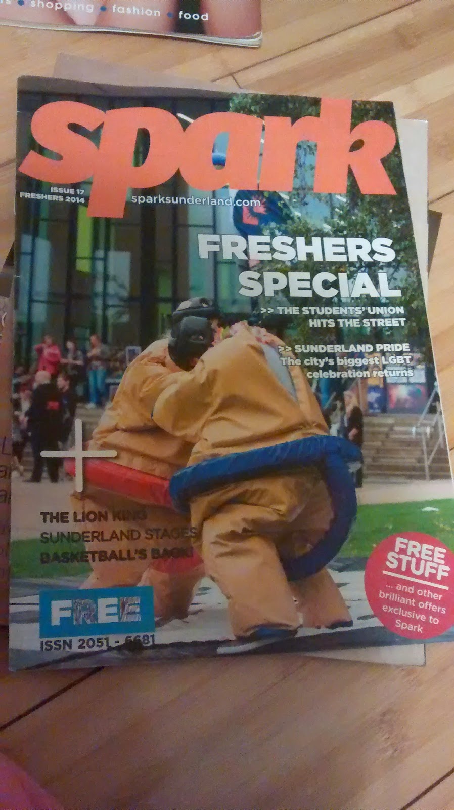
The main image of this magazine is taken outside of Sunderland university and is of some of the extra curricular activities that you can do if you go to Sunderland uni. So not only is this a magazine for what's happening in Sunderland uni but its also to promote to people who are thinking of going to Sunderland uni what they have to offer. 

We can tell that straight away who the target audience is from this magazines is students at uni with words used like ''fresher's'' and ''students'' also with the magazine being free it shows that tis magazine will be available in public areas where the magazine will be available to lots of people. 

There is a pug in the bottom right hand corner again selling the magazine to use by saying there ''free stuff'' within the magazine using very positive english like ''brilliant offers exclusive to spark'' again selling the magazine to the people. 

Something ive noticed is that magazine which are aimed at younger people tend to have a lot more busier front pages then to magazine that are aimed at older target audiences. I thinks that because when where younger we tend to lose interest in things really quickly and that is why kids magazine are jammed pack with stuff to keep the reader interests long enough for them to buy the magazine. 

The articles that are mentioned on the cover relate to the regional identity of the magazine which is Sunderland uni with articles like ''the student union hits the streets, the lion king Sunderland stages. 

Under the masthead of the magazine we have a web address to the magazine web page and the issue number and date. 


2nd Page 

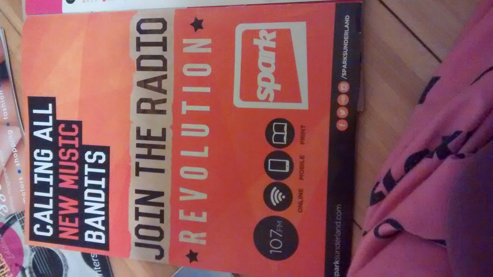
We have an advert for Sunderland uni local radio station. something local in the area to keep the magazine regional identity. 

3rd Page

This page is cleverly split up into different sections. one section for the contents, one bit with the editor letter by Emily park, and then the other parts are all the people who worked on the magazine. 

I like how the contents bit is layed out with the images to the articles at the bottom under all the other articles as it looks neater, but also the use of the colors really work here, again busy but not to busy. 

At the top of the page they have a big masthead telling the reader what's in the issue which I think goes well with the style of magazine this is. 

4th Page 

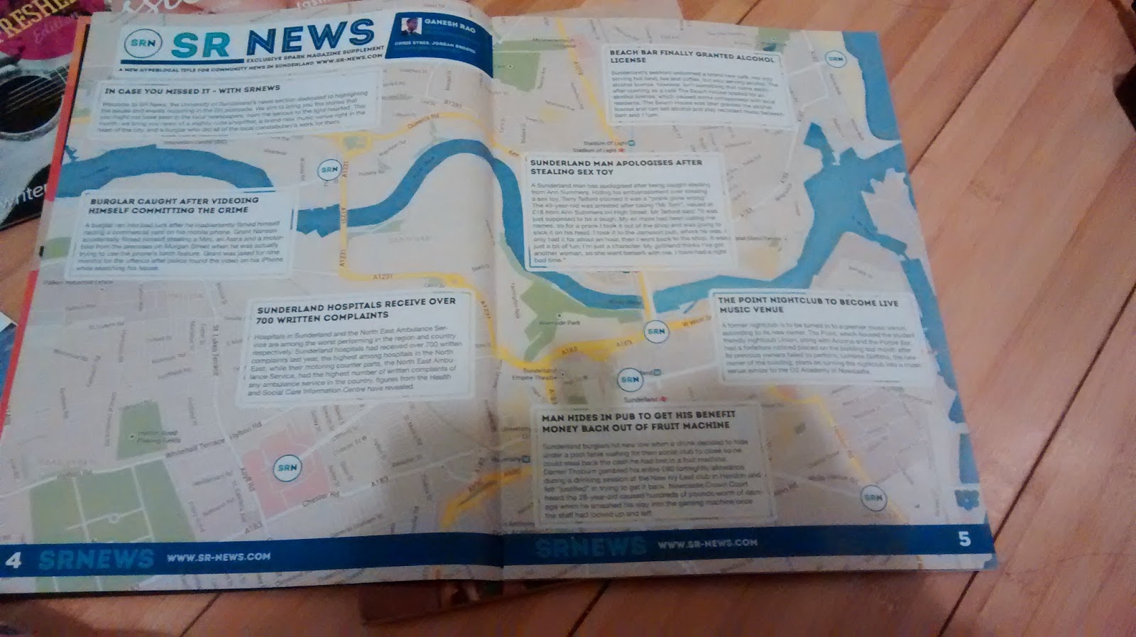
On this page we have a big map of Sunderland and then on the map we have key events and stories on what's happening in the area. with page furniture along the bottom linking in the web address to the Sunderland uni web-sight which will have more information on the stories. 

Overall the articles in this magazine just inform the reader at what's already happening and what's going on at the time and facilities within Sunderland uni. However I looked at the articles within the magazine and I've notice that the image quality is not that great but the lay out of the articles are short and to the point.  For example with the article ''fresher's week on spark FM'' we have the masthead at the top with ''sparks radio'' and the slogan ''on air- online- on mobile with again links to the web-sight and the person in charge ''Chris Murry'' we then have the article itself which is only 2 column however Next's to this we have an article about something else but still relating to Sparks Radio.  


I emailed the editor asking questions regarding the magazine and this is what they replied with:


Hi Siobhan,
Hope you're well. I've answered your questions as best I could below. Hope this is helpful and good luck with the rest of your A Levels!

1) We organise the distribution of the magazine, as we have a very small budget, being a student publication. A drop-off service delivers most (about 5,000) of the magazines to about 100 schools in the north east and the remaining copies are then scattered around the city, as well as throughout our two university campuses. This is done by volunteers, who tend to be students at the university.

2) Our magazine is primarily aimed at those living in Sunderland. I'd say, age-wise, our target demographic is those aged 15-25, although we know that other people have and do take an interest. Of course, we distribute to schools, so we try to keep this in mind, too. Our next issue is actually going to be a Prom Special.

3) In terms of marketing, we use posters and our accompanying radio station, SparkFM, to get the word out and about. Otherwise, it's more to do with having the magazines out and about where the people we're targeting can see them.

4) Our magazine's always been free, because it's a university publication. It's funded by the university's Students Union and advertising.

5) The magazine covers a broad range of things, so we hope that there's something in it for everyone. We try to promote the best of what Sunderland has to offer which, I think, gives our target audience a reason to like our magazine.

Thanks,

Emily.


Culture regional magazine analysis

Culture regional magazine analysis 

Front Page 

When looking at this magazine the first thing you see is the bold main image which gives you an idea of who this magazine is aimed at which judging from the image is around the age range of 20+. There not a lot of on the front page and the articles it has as headlines story also indicate the target audience as someone who has spare time and tastes for art and music so we can safely say this is aimed towards the higher working, middle class people. 

With the help of the page furniture at the bottom let of the cover ''supported by arts council england'' and then the page furniture at the top left ''the journal'' again hinting at its older audience again, with people who would read the journal newspaper. 

We can tell this is a regional magazine with the headline story ''berthing on Tyneside'' so we can assume that this magazine was given out around the tyneside area. something I will have to consider in my magazine when I made my headline story to make sure it linked to Durham. 

The colours work really well together with the grey background and the white text as the white text really stands out on the grey background. It also makes the magazine look more masculine so it appeals more to men then it would to a women. This hint at the content within the magazine as we expect from the cover that its going to be about what real men should ware and listen to.  You can even linked this to the title of the magazine being ''Culture'' link that with the image of the man that positioned in front of the title showing his dominance that you can say this magazine has masculine values at heart. 


2nd Page

Here we see a series of adverts that must be happening in the local area again highlighting and bringing to the reader attention that this is a regional magazine. Also this advert is for something that happening in Tyneside cinema which also is relevant to the target audience of this magazine.

When I make my magazine I will have to also see what going on in the local area and find something which links in with the interest of my target audience. 

3rd Page 

Here we have the page neatly separated in two with one half a little letter/ opening to the magazine from the editor which with this magazine is ''David Whetstone'' With a little quote and an image of the man himself giving a personal touch to the magazine. 

On the other half we have the contents of some of the articles in the magazine. with link to the cover stories on one side and inside stories to the right of it. Now what I found interesting is that there are two pictures with page number on them but no article title which in some ways peak my interest as I didn't know what the article was about other than what I could gather from the image. this I though was an interesting ways to get the reader flicking through the magazine as they will see this and also like me want to know whats the article is about. 

The colours used are basic and follows through from the front page still using the blacks on whites but also adding in some red to main the main headers stand out above the rest. Its easy to read and not to hard on the eyes which works well as an opening page for the magazine. 

4th Page 

This page is just a continued content page just with more adds and a little section about the team and a thank you to the people who supported the magazine. 

Overall looking though the magazine there a bit of everything in this magazine that is related to tyneside and the events that are happening in the local area which is something I would like to recreate in my magazine. With the articles in the magazine there not really a lot to them there quite short but to the point with really good images anchored to the text. 


As seen with this article about ''The Cuckoos reviewed'' we have an image of them on the top the main headline in the middle and then 3 columns of text under. on the side we have the page furniture of the magazine title, page number and the date. 


I emailed the editor of the magazine asking some questions regarding there magazine and here is the reply I got: 

Hi Siobhan,

Here are a few answers.... 

1) Culture magazine is distributed by ncjMedia (part of Trinity Mirror which publishes the Daily Mirror, Sunday Mirror and a lot of regional newspapers). It comes out free with The Journal once a month and is then distributed to arts venues in the North East.
2) The target audience is anyone who likes to read about music, theatre, art, food and events happening in the area. It has a useful listings section. The magazine is also available online - in magazine format - shortly after its print publication and can be found on www.thejournal.co.uk where some of the stories are also published separately.
3) The magazine is designed to appeal to readers of The Journal but ahead of publication we put word out via social media to whip up some demand.
4) The magazine is free because its cost are covered by advertising - and also by a partner system. Arts organisations can pay a one-off sum, up to £10,000, to have adverts or editorial in the magazine for the full year. There are various packages available.
5) Our audience seems to appreciate the listings service but I think they like the magazine because there isn't really anything else like it. It is not a lifestyle magazine or a chat magazine - just a serious look at what's happening culturally around the region.

Hope this helps. Best of luck with your studies,
Dave Whetstone,
Editor,
Cultu


regional magazine research

With a range of regional magazine out there already I think the best way for me to create one of these is to look at what already out there and see what code and conventions there doing and see what I like, what I don't like and whats works within today market. This way I can see what I would like to incorporate into my magazine. 

I will be looking at a series of different magazine to get a wide range of research on the different types of magazines that are out in the market. these magazine are: Culture, Spark, The Crack, ECT, Living and Vibe. 

Not only will I be looking at them but I will also contact by email asking some questions about what/ who are there target market and how do they attract and deliver to there target market. This will give me more information for my research which I can use when I make my magazine. 

Here are the questions that I emailed out to the different magazine editors. 
  • Who distributes your magazine?
  • Who are the target audience for your magazine?
  • What do your target audience like about your magazine?
  • How do you market your magazine to your target audience?
  • Why is your magazine free?

As most of the magazines have there own web sight I will also be looking on there for any information about the magazine; again this will help with gathering more information which will come handy when I make my magazine. 


AS Media coursework on regional magazines

For my A2 media coursework im going to be looking at regional magazines. where I have to create a 4 page magazine on something thats not already out in the market. 

So looking around at the magazines that are already out there we already have a lifestyle , listing, food and cultural magazines. From magazines like ECT, Vibe, Living, Culture, Spark and The Crack. 

which gives me the options of doing a regional magazine about the following themes: 
  • music 
  • film
  • young lifestyle
  • sport\football
  • photography
  • women's
  • men's
  • children magazine
  • food-Local stuff
  • Durham 

Out of all these themes I personally like the youth lifestyle, photography, film and the durham magazine. this is because these are the ones that most interest me.  However I narrowed the options down again as I realised that some of the options that I choses would not be really a realistic thing I could do with the resources I have. So the theme that I choose to do is a regional magazine about Durham. I was close to young lifestyle but choosing just young lifestyle limited me to just write about things related to youths. Which I do have articles and resources for this idea but I want to look at Durham in a whole which lets me have more of an open book on things as then I can look at things in my local area and things that are happening within my college at the same time.