Front Page

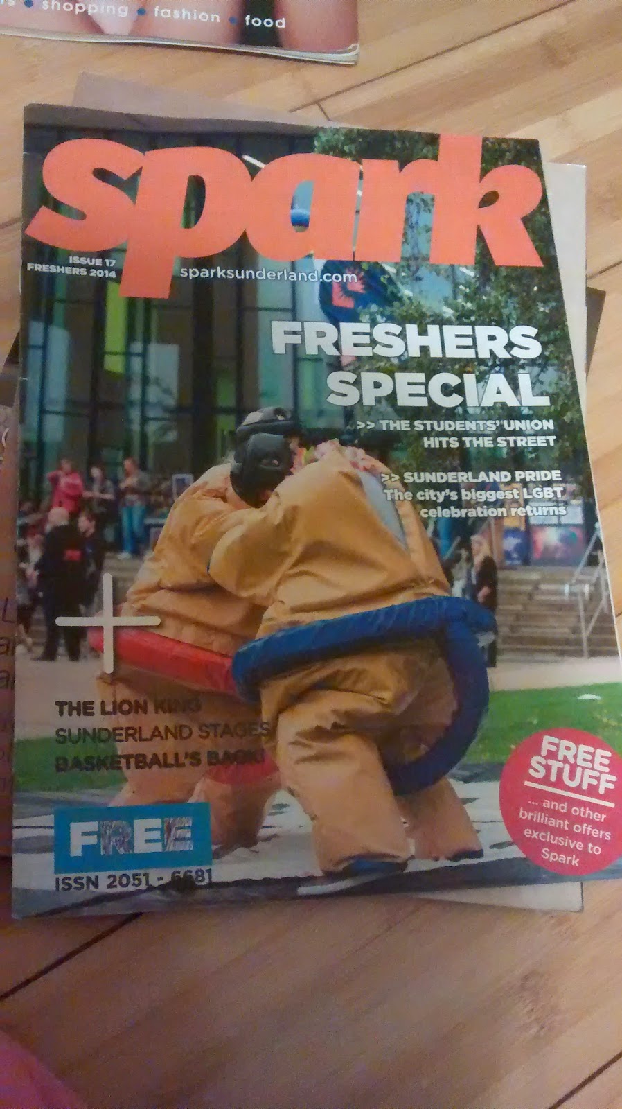
The main image of this magazine is taken outside of Sunderland university and is of some of the extra curricular activities that you can do if you go to Sunderland uni. So not only is this a magazine for what's happening in Sunderland uni but its also to promote to people who are thinking of going to Sunderland uni what they have to offer.
We can tell that straight away who the target audience is from this magazines is students at uni with words used like ''fresher's'' and ''students'' also with the magazine being free it shows that tis magazine will be available in public areas where the magazine will be available to lots of people.
There is a pug in the bottom right hand corner again selling the magazine to use by saying there ''free stuff'' within the magazine using very positive english like ''brilliant offers exclusive to spark'' again selling the magazine to the people.
Something ive noticed is that magazine which are aimed at younger people tend to have a lot more busier front pages then to magazine that are aimed at older target audiences. I thinks that because when where younger we tend to lose interest in things really quickly and that is why kids magazine are jammed pack with stuff to keep the reader interests long enough for them to buy the magazine.
The articles that are mentioned on the cover relate to the regional identity of the magazine which is Sunderland uni with articles like ''the student union hits the streets, the lion king Sunderland stages.
Under the masthead of the magazine we have a web address to the magazine web page and the issue number and date.
2nd Page

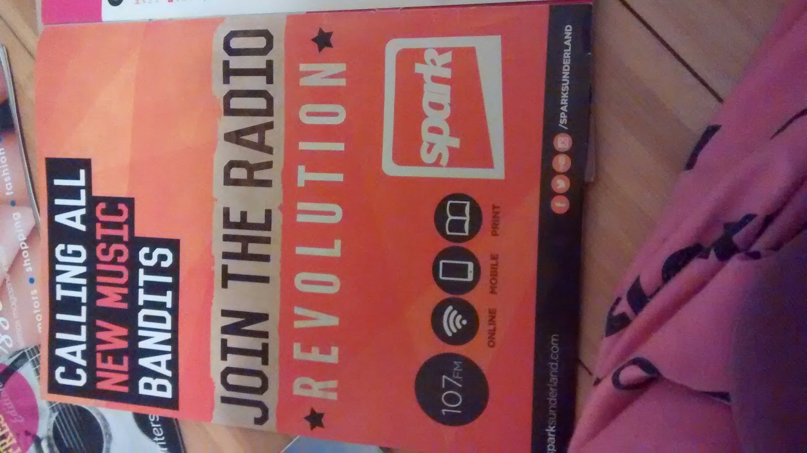
We have an advert for Sunderland uni local radio station. something local in the area to keep the magazine regional identity.
3rd Page
This page is cleverly split up into different sections. one section for the contents, one bit with the editor letter by Emily park, and then the other parts are all the people who worked on the magazine.
I like how the contents bit is layed out with the images to the articles at the bottom under all the other articles as it looks neater, but also the use of the colors really work here, again busy but not to busy.
At the top of the page they have a big masthead telling the reader what's in the issue which I think goes well with the style of magazine this is.
4th Page
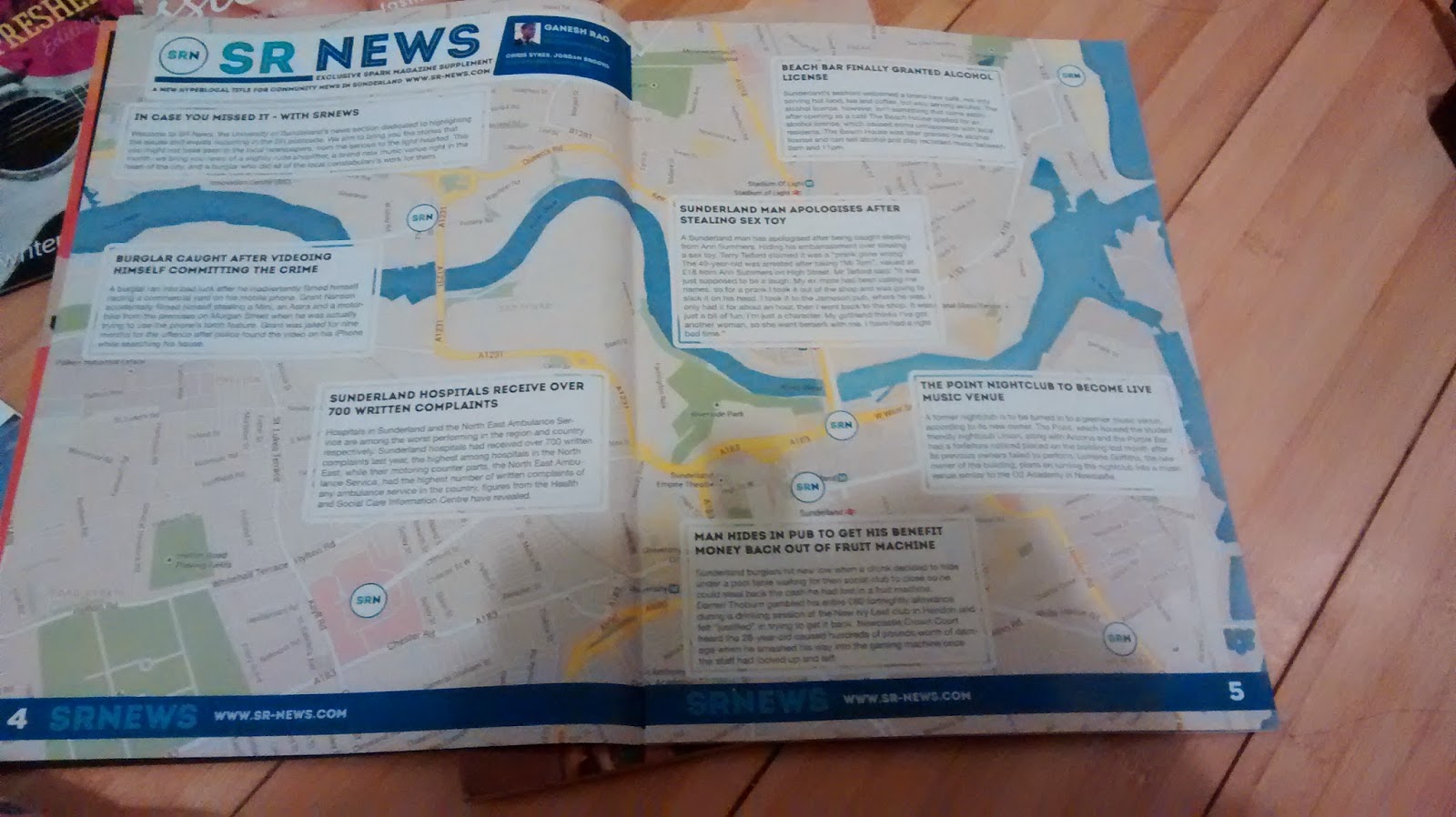
On this page we have a big map of Sunderland and then on the map we have key events and stories on what's happening in the area. with page furniture along the bottom linking in the web address to the Sunderland uni web-sight which will have more information on the stories.

Overall the articles in this magazine just inform the reader at what's already happening and what's going on at the time and facilities within Sunderland uni. However I looked at the articles within the magazine and I've notice that the image quality is not that great but the lay out of the articles are short and to the point. For example with the article ''fresher's week on spark FM'' we have the masthead at the top with ''sparks radio'' and the slogan ''on air- online- on mobile with again links to the web-sight and the person in charge ''Chris Murry'' we then have the article itself which is only 2 column however Next's to this we have an article about something else but still relating to Sparks Radio.
I emailed the editor asking questions regarding the magazine and this is what they replied with:
Hi Siobhan,
Hope you're well. I've answered your questions as best I could below. Hope this is helpful and good luck with the rest of your A Levels!1) We organise the distribution of the magazine, as we have a very small budget, being a student publication. A drop-off service delivers most (about 5,000) of the magazines to about 100 schools in the north east and the remaining copies are then scattered around the city, as well as throughout our two university campuses. This is done by volunteers, who tend to be students at the university.
2) Our magazine is primarily aimed at those living in Sunderland. I'd say, age-wise, our target demographic is those aged 15-25, although we know that other people have and do take an interest. Of course, we distribute to schools, so we try to keep this in mind, too. Our next issue is actually going to be a Prom Special.
3) In terms of marketing, we use posters and our accompanying radio station, SparkFM, to get the word out and about. Otherwise, it's more to do with having the magazines out and about where the people we're targeting can see them.
4) Our magazine's always been free, because it's a university publication. It's funded by the university's Students Union and advertising.
5) The magazine covers a broad range of things, so we hope that there's something in it for everyone. We try to promote the best of what Sunderland has to offer which, I think, gives our target audience a reason to like our magazine.
Thanks,
Emily.

No comments:
Post a Comment