Thursday, 20 March 2014

Makeing a music magazine


When making a music magazine or any magazine there are some steps in which you can follow if you want you magazine to be successful : http://contentmarketinginstitute.com/2011/08/6-steps-for-producing-a-custom-magazine/


  1. Have a deadline of the plan of your magazine to your editor 
  2. Design a draft for the magazine which will be looked at by a graphic designer 
  3. Have like a story board of all the articals that are going to appear in you magazine.- this is so you can see the content overall and see if it fits or not with your theme 
  4. Printing deadline
  5. Distribution date (sales and marketing)
  6. Content plan 
  7. Plan for each article 
  8. Check 


Now I have been doing some research into making a magazine on the internet and stumbled on this artical which is in a magazine itself by Cosmopolitan http://www.cosmopolitan.co.uk/_mobile/campus/cash-and-careers/student-careers/self-publish-your-book-magazine
it basically gives you a idea of what you have to do to make your own magazine. 

1. Hire a designer
2. Get someone to proof read for you (again and again and again!)
3. Find a printer
4. Content is key
5. Realise that it is up to you to sell your product


A NOTE FROM ME :3 
After reading these I have taken aboard that making a magazine isn't going to be like coming in one day and having a magazine in one day. I will have to plan and develop my skills of being a photographer, journalist and editor which is something that I have never done before but I am up for the challenge. 

Institutional context

How you may ask is how am I going to distributed my magazine now ive been thinking that the best way is to got to a big distributing company  like Bauer as they have distributed lots of music magazine which are very successful today and allow them to distribute my magazine to all the supermarkets to get my magazine to its maximum target audience instead of me trying to sell the market my magazine myself. I could make it free to download like a game magazine that I get every mouth sent to my email and all i had to do was subscribe to the web-sight which was free of charge

http://www.gamerzines.com/ web-sight for free online magazine which you can have an online addition or an interactive PDFs

Here are some comments from my questionnaire about having a digital copy of a magazine.


  • magazine form because then you have a physical copy and they are alot easier plus you can just read and then disguard instead of having to delete it from a device


  • I think I'd prefer to read it on an iPhone/iPad or whatever, as it's less fuss, I don't have to carry anything around, I have it on my phone and it won't get damaged, I get new issues automatically, I don't have to leave my house as I can simply download it at the touch of a button


  • Digital Copy - As it's easier to carry around then a magazine (use phone).


  • iPhone, easier and cheaper to access


  • On a magazine because it will be easier to use because its just there but for phone u have to be worried about 
  • connection and u might not see everything but a magazine u will have it with you.


  • Magazine form because I personally prefer the feeling of reading a physical publication


  • Magazine form, because a hard copy is so good, the feel of one in between your hands, it is so amazing.


  • Magazine, because I like physical media


  • magazine form - I like to be able to hold it and turn the pages. Also being able to gather the posters without the need for either downloads or printing is good.


  • a nice internet page would work :D


  • no cause thats stuff is usless if i have no internet


  • I'd like to read a digital copy of a magazine, it'd be more comfortable and more ecology.


  • paper copy, I like to feel of magazine and also it enables you to cut out things from it


  • Physical Magazine. If I wanted it on my Phone I could easily find the info for free. Physical Media is good for Journeys.


  • Magazine form because you can keep it and actually feel it and treasure it.


  • A magazine type magazine. It's so much more accessible and easier to get.


I can see the benefit from doing this but I don't think  they have a big enough audience to market this as a paid magazine as I only really found out about this magazine by chance. and most people don't like having a digital copy but want a physical copy. 
However if I do go with the big company to distribute my magazine I will have to have them look at the content of magazine and see if they want to take the risk with the pop theme even though there isn't a market for that theme of music. They may make me work with the conventions or not take my magazine until I can show them that I have an audience that want my magazine so I could use the idea of the free magazine for subscribers to get an audience then when i have the demand for the magazine I can get the suppler to supply the demand. 

Development of my front cover and content page


Development 3 in making my magazine where I focused on finishing my front cover and starting my contents page. 


Here is my contents page and I have decided to use the inspiration that I have seen in top of the pops magazine and used my front cover to be in my contents page to show were in my magazine is the cover stories. I though this was a fun and interactive way to help my target audience reader get interested in the articles and be more reader friendly. It also shows that I am following conventions instead of going against them as if other magazine do it, it must work with the audience at hand. 

Looking back at this I need to move the front cover image up to fill in the open gap at the top. move the header to allow room for the logo at the top and I am going to make sure that my section headers are all level as with them being all unbalanced its not very appealing to the eyes.


I have used the founts orange peel for the big headlines and headers and opfifico for my text. This is because the orange peel font bring continuation of using the same font into my magazine and the opfico font is easy to read and has a pop style look to it which fits my genera for my magazine. 

I have used solid pink lines to separate the different articles which I think works well to keep my magazine contents look professional and easy to read. With the use of pink and blue I think that these two colors stand out well together and appeal to the female audience which is my target audience.

For all the articles I had to make sure they were all in line with each other using the same font size of 14. This again was so that it was easier on the eyes for the reader. I have included album releases of the up to date artist for some of my articles. I got the artist from my research when looking at magazine cover to see who was on other pop magazine to know which are the artist that I need to include to attract the right target audience for my magazine. 


As my main header I have used the words ''tune in for...'' this links in to the remix title and when you hear it you get a pop feel to it. I have added the ellipsis to add to the effect of the contents page as when you use them there normally a list after it. So this set up the whats inside the magazine feel; its also eluded to mystery as there is no answer so you are left wounding and wanting to know what your ''tuning in for''. This header is also nostalgic for the older audience for my magazine as ''tuning in'' sounds like your tuning in an old radio. which gave me an idea for my logo which if you look back at my older post when I tried to hand draw my masthead i have a drawing of an radio which i want to see if it fits in with my magazine to be my logo. 


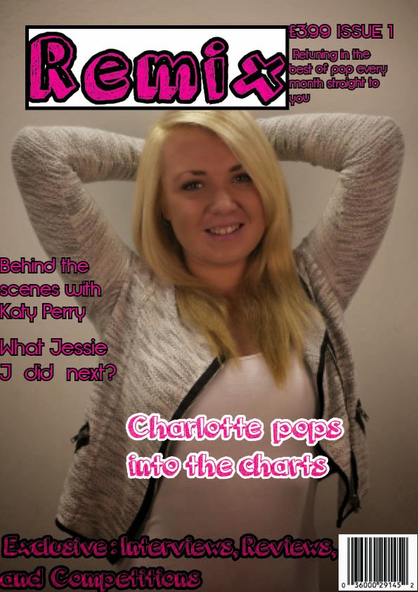
Here is my front cover or what my front cover looked like before and you can see that i needed a way to get my mast head to stand out and basically all my sell line and my heading to stand out more. this is because from putting my magazine out on the shelves in the Tesco and in my college i was able to see that my magazine against the other magazine didn't stand out as well.


Now I have made all the founts bigger and the wight of the font I have increased to allow the outlining of the second color of the font to be a bit thicker allowing for the font to stand out a bit better than before. The colors pink and black and pink and white goes well together as two contrasting colors which stand out and go with the theme of pop in my magazine. Pink is also a stereotypical girls color so it will appeal more to the female side of the audience.


I have moved my masthead from being on an angle to going straight across my magazine as from putting my magazine on the shelves at the supermarket I could see the dominate magazine had the masthead in bold across the top of the magazine. I have left a little space on the top right hand corner as I am planning to put the radio I have hand drawn into that corner as my logo. I have made my slogan go all the way across my magazine which I feel allows the reader to see what it says more clearly than before. 

I'm going to have to sort out my sell line at the bottom as from making the text bigger I have sightly made some of the text go behind the bar-code. I'm also going to have to put the black background back behind my price and issue number as it just doesn't stand out at all. This may be due to the grayish back ground which I will have to go on photo-shop and change. 

A little thing that has happen has now made me bring in someone else for my model of the magazine as I need to find someone who can come in and look the part and I think I may have found someone who I am hoping to get in to do a photo-shoot next Thursday; but I will keep you updated with that in later posts.

Monday, 3 March 2014

Asking people on facebook and people around my college about my frount cover


I asked people on facebook and people around my college to look at my 2 drafts for my front cover and: I need your opinion on which looks better, and your response to these magazine covers and how could I improve on them and make them better. (this is just a draft for my media coursework)


(Facebook)
Just needs cropping, lots of empty space up top...
If it were me, i'd move the model a little to the right, that way the focus of attention will be balance between her and the mag title (it'll be ok to crop her left arm, it'll make the shot tighter). I'll move "remix" a bit lower
Other than that, great job, love the font you used...''


(people)
  • The masthead needs to be over or behind the image to make it look more professional.
  • Sell line needs to be a bit down and larger- as it quite hard to read.
  • Change masthead font as it looks to pixulated- my be due to the printer
  • Put text in the space next to the masthead.
  • Change the colour of the main head line to something more easy to read.


(Facebook)
I like the contrast of colours, the image on this is more fitted for the style with the darkness of it, whereas the other was to bright.

Tips from my a-level media and film days:

-Make the Main sell-line much bigger
- Move the image forwards in-font of the title.
- Move the price and issue number down next to the bar code and shrink the size of it, for it is unimportant detail. Include a website to the magazine next to the bar code as well.''


(people)
  •  Masthead bigger
  • The girl needs to look more pop
  • The style of fonts looks young and will attract a younger target audience.
  • The white font looks good.
  • Font for the sell line to be in the same fount as the masthead.

Sunday, 2 March 2014

Putting my first draft of a music magazine with other music magazine in shops


Here I decided to put my magazine in the magazine secton in college to see what my magazine will look like agaist other music magazine.


Even though the college library does not have lots of music magazines I still wanted to see what my magazine looks next to them. As you can see my masthead dose not stand out from the other music magazine. Which is something I need to change to follow the conventions of a magazine. 

Another thing which I may need to change is the fonts size of my sell lines. This is because the sell lines on my magazine seems to all merge into one . 


With these I went to Tesco magazine section and but my magazine in the shelves provided and was quite surprised that my magazine fits in well with the other magazine around it. The main difference here is there is more music magazine which shows the sheer competitions of all the other music magazine.


From doing this I can see how my magazine fits in with the other music magazine and see if I needed to change the way that my magazine looks to fit better with its competition. 

I can see from doing this that my background for my image needed to be white and not this dull grey  colour.This is because from looking at the magazine around it; The grey background makes the person in the image look too dark. 


I may need to make my fount bigger to make the magazine healines and masthead stand out a bit more. As you can see that the other music magazine use a white on a dark background/dark on light background. from doing this the masthead stands out more from the rest. 

Friday, 28 February 2014

Front cover design progress 2


Here is another verion of my draft music magazine were i have used the founts orange jucie with a pink on black tint to it as the blue i had used before didn't stand out as well when you looked at it from a distance.


Here is what the magazine looked before, and you can see that i have moved the masthead from being tilted to going across the top so it stands out more and is more easy to read. i also had to make all the sell lines bigger so make them more clearer to read.


for any idea that i could do to improve my magazine, i would love to hear feedback.

Monday, 24 February 2014

Drawing my masthead for my magazine

 
I decided to use Remix as the title of my music magazine as it fits in with the pop theme that i want to portray. Here I decided to use illistrator to draw my masthead for the cover. useing the brush tool I was able to create this which i through was a good way to attract my target audience being teens. this is because the way that the title looks messy and not symmetrical gives it a younger feel to it; but it I used a clear symmetrical masthead fount it would appeal to the older target market. by trying to draw my masthead I have challenge conventions.
 
 
Under the masthead I have the logo which i tried to make which looks like a radio. not really related to the pop theme but I may use it in the contence page as I have the main header instead of what in the mag/contence page I have tuning in for- were the raido would fit perfecly in there as you have to tune your radio right to get the sound.
 

Here is the masthead on it on with out the logo. As you can see I have a little person when at the time I just randomy draw him there but now that im looking at it; the little man represents maybe a person at a concet listening to pop music. Orgianal the colour of the title was black but I changes it to blue as its my fav colour but also made it light blue rather that dark blue as this can appeal to girls and boys at the  same time.
 
Conculsions

Even though I spent a lot of time on this and I really like this; when I put this on my magazine with the main image the masthead didn't stand out well among all the other magazine. which is why I won't be useing this im my final magazine.